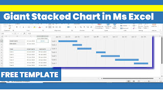
|| Dyanamic Stacked Chart ||
To create a stacked chart in Microsoft Excel, follow these steps:
1. Select the data you want to chart, including the categories and values.
2. Go to the "Insert" tab in the ribbon.
3. Click on the "Column" or "Bar" chart button (depending on your preference).
4. Select the "Stacked" chart subtype.
5. Choose the chart layout and formatting options as desired.
6. Click "OK" to create the chart.
Tips:
- Make sure your data is organized with categories in one column and corresponding values in another.
- Use the "Series" option to select which columns to include in the stack.
- Use the "Axis Label" option to customize the labels on the x and y axes.
- Use the "Legend" option to customize the chart legend.
Here's a more detailed step-by-step guide:
1. Select the data range (A1:B5, for example).
2. Go to the "Insert" tab.
3. Click on "Column" or "Bar" chart.
4. Select "Stacked Column" or "Stacked Bar".
5. Choose a chart layout (e.g., "Clustered" or "Stacked").
6. Click "OK".
7. Right-click on the chart and select "Select Data".
8. In the "Legend Entries" box, select the series you want to stack.
9. Click "OK".
Now you have a stacked chart in Excel!
Free File Link


Comments
Post a Comment